
15 months ago, we announced the release of our open-source framework: LumX.
Since then, we intensively used the tool, many people from UX/UI developer community stress-tested and submitted features…
So we decided to rethink LumX that’s why we completely re-write it.
Thanks to that, LumX is now more efficient and lighter. It also provides more options and a real documentation.
Same basics
The basics of this responsive front-end framework remain the same:
- AngularJS components,
- CSS Framework based on Sass,
- Google Material Design guidelines followed in a pixel perfect way.
Style helpers
LumX v1.0.0rc1 is still a graphic components library but it has turned into a real CSS framework thanks to the style helpers which are available while developing projects.
In LumX, developers will now find:
- Material Design color palette,
- A simple grid system based on flexbox,
- Some mixins for faster developments,
- Some typographic basic styles.
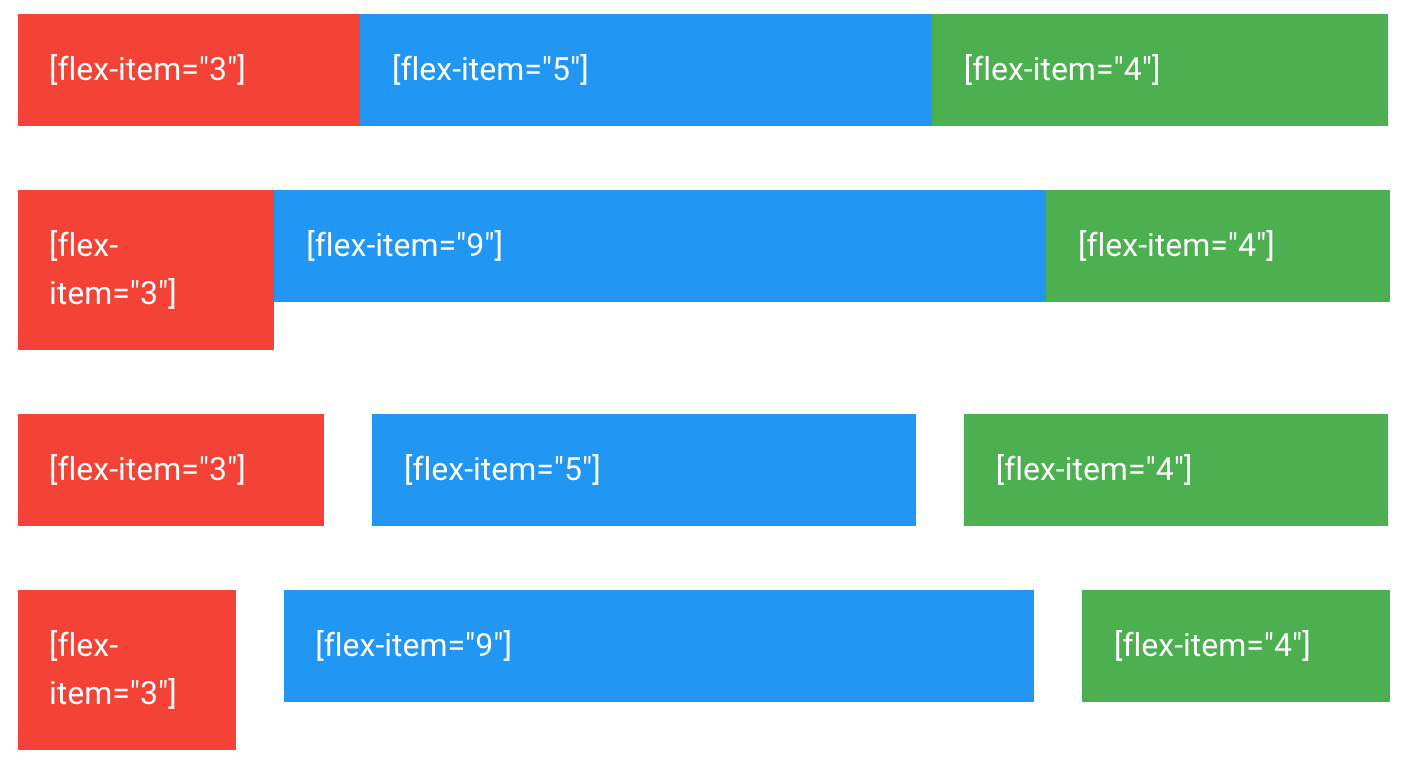 LumX Flexbox
Components improvements
All components have been improved as many bugs have been fixed. Also some awesome new features have been released.
For instance, the ‘Datepicker’ has been enriched and allows to add min date and max date parameters.
LumX is still improving thanks to every people who play with it and submit new features to the LumApps team. In the coming weeks, a stable version of LumX V1 will be released. Until then, follow us on twitter to discover one LumX feature per day.